Background
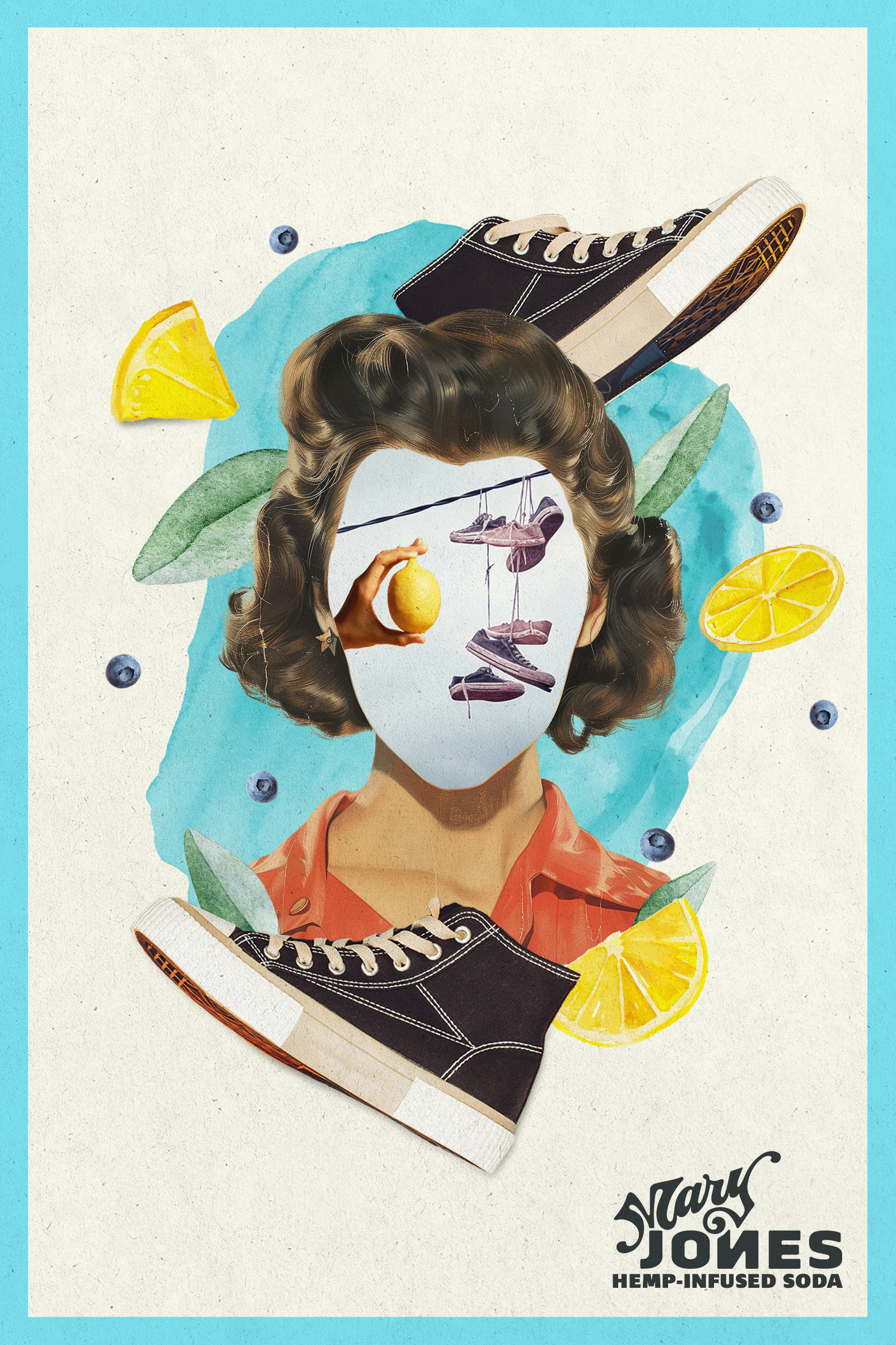
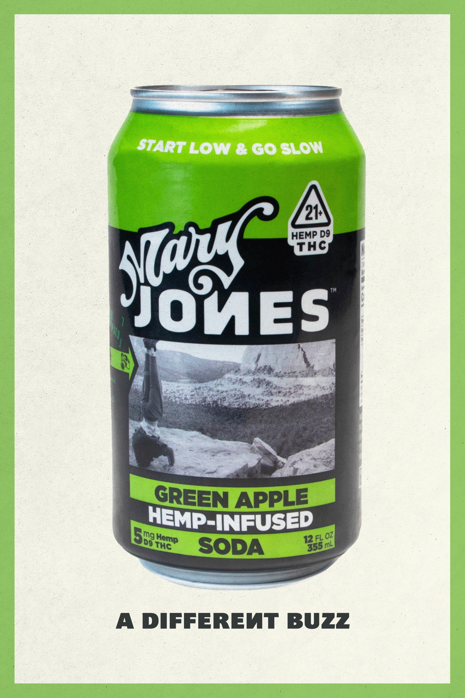
Weed branding usually goes one of two ways: tie-dye clichés or clinical dispensary chic. Mary Jones is neither. So for their NYC subway debut, we designed a visual system that stood out by leaning in—without selling out.
The design said “zine kid with taste.” The copy said “high.” And together, it cut through a category stuck between caricature and control.


